Validation of liquid chromatography mass spectrometry (LC-MS) methods
10.5 Bonus section: DoE introduction for beginner
Table of Contents
1. Design of Experiments (DoE) in chromatographic method development and validation
4.1 Model Formation through DoE
5.1.1 2-Level Full Factorial Design
5.1.2 3-Level Full Factorial Design
5.1.3 Full factorial design example
5.1.5 Box-Behnken design example
5.1.6 Box-Behnken vs Full-factorial design example
5.2.1 Fractional factorial design
6 Messy results: Fractional Factorial Design with 7 Factors for MS
Vocabulary
Throughout this section, we will adopt specific terminology. While we will consistently use this set of terms, it’s essential to recognize that the vocabulary can vary across different disciplines or sectors where DoE is implemented. Nonetheless, the foundational concepts represent are universal.
Factor: A method parameter (e.g., mobile phase pH, extraction time, LC column, MS collision energy) that influences a particular response value (like peak area, Rs, ).
Effect: An element of the empirical model derived from the outcomes of DoE experiments (e.g. specific factors´ effect or interaction effect of several factors).
Response: The observed value influenced by variations in method parameters – factors. Responses can be for example peak area, trueness, peak separation.
Design: A strategic combination of factor levels, chosen specifically to discern their impact on the response in an efficient way.
Factor Level: The precise value or state of a factor. Such a level might represent the actual chemical value or its coded equivalent. For instance, the pH of the mobile phase (a factor) might have values of 8.0, 9.0, and 10.0 in a particular design, with their corresponding coded values being -1, 0, and +1, respectively.
Coded Value: This is a streamlined representation of a parameter, intended to simplify statistical data analysis and comparison. The process of coding essentially standardizes diverse factors, ensuring they are relatable even if they operate on different scales or units. To illustrate, let’s consider pH values of 8.0, 9.0, and 10.0 juxtaposed with concentrations of 0.001 mg/ml, 0.0015 mg/ml, and 0.002 mg/ml. While these factors might differ substantially in terms of units and magnitude of change, coding them as -1, 0, and +1 ensures we can uniformly evaluate their effects on results. So, a factor level can be represented by the actual values or their respective coded values (see Factor Level).

(Eq 1.1)
1. Design of Experiments (DoE) in chromatographic method development and validation
The primary aim of this section is to give introduction into the utilization of DoE within the realm of chromatographic method development and validation. This information is sufficient so that users can start using DoE on their own. For chromatographic methods, DoE is mostly employed to determine the of a method, which essentially measures how a method responds to varying one or multiple of its parameters. Such parameters might be a pH of the mobile phase or a salt concentration in the mobile phase, MS collision energies, a duration or pH of sample pretreatment extraction, among others. In order to understand the influence when these parameters are modified, responses, such as peak area, peak separation or trueness, are observed. Broadly speaking, our goal is to determine whether a specific parameter genuinely impacts the value of interest, and if so, quantify the magnitude of its influence on the response(s).
Example of the effect a parameter might have on peak area:

(Fig 1.1)
2. OFAT vs DoE
The One-Factor-At-A-Time (OFAT) approach is often adopted in laboratories that either lack access to specialized software for DoE or the personnel is not adequately trained in DoE methodologies. Similar to DoE, OFAT estimates the effect of parameter modification on the response.
Take a look at section 10.3 for how to do OFAT, we will not duplicate this here.

(Fig 2.1)
OFAT process can often require a degree of guessing, and sometimes luck but also experience. An experimenter might have started with the pH, then moved on to the concentration, or even selected point 2-0 as optimal for concentration.
Although here we see an actual contour plot for the experiment, for the experimenter the picture looks just like this:

(Fig 2.2)
That is, we just see the higher or lower values for specific measurements. To further explain the point, consider a DoE experiment conducted with the same parameters and same start point as OFAT. Here we have the DoE experiments overlayed to the previous OFAT experiment. The 9 DoE points create a rectangular design region.

(Fig 2.3)
From these 9 DoE experiment points, we can derive a contour plot, marked on the previous figure with the dashed box.

(Fig 2.4)
When we have a contour plot, we see clearly how the values change when we change the parameters value. We also see clearly in what direction the true optimum lies (the upper right corner of the DoE experiment space).
In a nutshell, when the objective is pinpointing the actual optimum, DoE is more efficient, clear, and statistically robust compared to OFAT. However, if the requirements are more modest—limited to a basic grasp of a few parameters, and where potential interactions are unlikely to occur—OFAT can indeed be the cost-efficient choice, circumventing the need for intricate know-how or specialized software.
Below is an overview of the benefits and disadvantages of the two approaches:
Benefits of OFAT and DoE approaches
| OFAT | DoE |
|
|
(Table 2.1)
Disadvantages of OFAT and DoE approaches
| OFAT | DoE |
|
|
(Table 2.2)
3. Software for DoE
DoE is best approached with dedicated software. While employing spreadsheet software for rudimentary tasks might initially find success, its limitations become apparent as the designs grow in complexity and diversity. Furthermore, our primary focus is on the application of DoE in the realm of chemistry, not the intricate details of its implementation, statistical methods, or the use of graphing tools. Setting these up manually would be time-consuming and counterproductive.
For the purposes of this course, a specialized module of the ValChrom software will be utilized, explicitly tailored for designing DoE experiments and interpreting their results. This tool was developed at the Chair of Analytical Chemistry at the University of Tartu.
![]()
You can access the software here: https://valchrom.ut.ee/doe
Not only is it free to use, but it also removes the need for account registration, ensuring a hassle-free experience.
However, a crucial point to remember is that your session in the software will only last until you either refresh your page or close the browser. This means if you’ve made significant modifications, for instance to experiment designs, always ensure that you’ve downloaded the design file prior to reloading or exiting your browser. As we progress through the course, we’ll familiarize ourselves with the software, supported by practical examples.
Also, in case of lots of data (a lot of different response columns or factors) the amount of graphs being rendered can be too much for some browsers. In this case some 3D graphs might be empty. In this case we recommend to 1) use filter to unselect everything and only select the combinations you are interested in to refresh graphs, 2) upload factors with 1 response column at a time or 2) use Firefox browser (it might take some time to calculate all the graphs). We are working on improving this experience.
Being a work in progress, your feedback for the software is invaluable. If you have insights or suggestions to enhance the tool, please do share them. There’s a feedback button situated at the lower right corner of the DoE page for this purpose. Your input is greatly appreciated.

(Fig 3.1)
4. DoE basics
Having established an initial understanding of DoE’s advantages, it’s time to delve deeper into its core principles and applications. In this section we will cover the heart of DoE – that is the model – by going through its basic concepts and a simple example experiment and interpretation of its results.
4.1 Model Formation through DoE
At the heart of the DoE approach is model formation. Through systematic experimentation, DoE enables us to craft a predictive model elucidating the relationship between responses and factors. This model is not just created out of our guesswork, but based on the actual data we measure during a DoE experiment, i.e., it’s an empirical model.
Imagine being an analytical chemist, tasked with amplifying the extraction yield of a specific compound from a complex mixture. Through preliminary assessment, you identify two potential influencers on this yield:
- The pH level of the extraction solution
- The concentration of various salting agents (like NaCl, MgCl, etc.)
By adopting the DoE strategy, you conduct a series of experiments varying the pH and the concentration levels. The resulting data helps you generate the following model:

(Eq 4.1)
This model now acts as a predictive tool. Want to predict how a slight change in pH or concentration might alter the extraction yield? The model provides the answer. Moreover, through statistical tests embedded within DoE, the significance of each factor can be determined. This empowers to make assertions about their impact on the yield, fortified with statistical assurance.
DoE’s primary objective can be illustrated as:

(Eq 4.2)
In essence, it’s about ascertaining the coefficient values for diverse parameters. These coefficients, in turn, reveal the influence of specific factors and their interactions on the response (effects). The greyed-out coefficient is intercept for the method. It shows what is the response if all factors are at the initial levels, none modified for higher or lower values.
Consider a scenario where four distinct factors – pH, salt concentration, mobile phase flow rate, and column oven temperature – influence a particular response. After conducting appropriate experiments, a model is obtained:

(Eq 4.3)
From this model, the individual coefficients for each factor are apparent. Additionally, it showcases coefficients for their 2nd order interactions (like AB, AC, and so on). While it’s technically feasible to incorporate 3rd and 4th order interactions, their influence is generally marginal and often disregarded in most applications (although not always, see section “When experiments do not go as planned”). Hence, for this example’s simplicity, we will look up to 2nd order interactions and disregard others.
From this empirical model, certain insights are immediately apparent. Both factors pH and salt concentration, along with their combined interaction, bear substantial coefficients. In contrast, the rest seem to have minimal influence, at least compared to the most influential ones. It is worth mentioning, that the ones we leave out (grey), might actually be meaningful factors that also have statistically significant effect on the response. So, a more thorough model should include them as well. However, if we are constrained in our resources, then the ones that have an order of magnitude larger effect are the ones we should optimize first (in this case pH, concentration and their interaction).

(Eq 4.4)
It’s only logical to channel our experiments to use the parameters that matter the most. If factors pH and salt concentration overwhelmingly influence the response, then resources (be it time, laboratory equipment, or reagents) should be optimized for these parameters, rather than scattering them thinly across inconsequential variables. This approach ensures we’re maximizing output without wasting precious resources, exemplifying the essence of Design of Experiments.

(Eq 4.5)
We have arrived at a simplified yet potent model, focusing exclusively on the pivotal factors. Such an empirical model is devised for predictive purposes. Its strength lies in its reliability within specified boundaries or ranges, known as interpolation. On the flip side, it might falter when stretched beyond these limits, an area termed extrapolation. Straying too far outside the range of experimental data can lead to unpredictable results, as the model is built on the response data within those specific ranges.
Let’s consider a practical application to bring this concept into sharper relief. Suppose we are developing an LC method. Our objective? Enhancing peak separation for a specific compound. After rigorous experimentation, we find two critical factors that overwhelmingly influence our desired response: the pH of the mobile phase and its flow rate. Not just their individual effects, but their combined interaction also plays a significant role.
Our derived empirical model might look something like this:
Rs = 0.4 x pH + -4.0 x Flow Rate + 0.6 x pH x Flow Rate + 2.5 x Flow Rate2
(Eq 4.6)
In the course of our experiments, we change the pH through a with values of 4.0, 4.5, and 5.0. Concurrently, the flow rate was varied with these values: 0.6 ml/min, 0.7 ml/min, and 0.8 ml/min.
Given this range, our model can predict the response, Rs, at any given point within this specified domain of pH and flow rate. By plotting these predicted responses over the range of our factors, we can generate a contour plot. This visual representation elucidates how our resolution (Rs) varies across the spectrum of pH and flow rate combinations. It’s a powerful tool to collect insights and to pinpoint optimum conditions within the tested range.

(Fig 4.1)
This contour plot offers valuable insight into the direction we should pursue to achieve optimal separation (Rs >1.5). Visualization plays an important role in making sense of DoE results. The more diverse and intricate the data, the greater the need for effective, intuitive graphical representations to aid understanding and facilitate decision-making.
There is a myriad of ways to visualize and analyze DoE data, each serving its unique purpose and providing different perspectives on the information. We will delve deeper into these visualization techniques and tools in a later section.
Now that we’ve touched upon the core benefits and applications of DoE, let’s further unravel its foundational concepts.
4.2 Concepts
4.2.1 Factors and response
We’ve previously discussed how factors are the methodological input parameters that influence an observable variable, or our response. Factors could be anything from the extraction time which impacts the extraction yield, to the flow rate affecting peak separation, or even fragmentation energies influencing the area of the fragment peak. By adjusting these factor values, we gain insight into how the method response fluctuates. This helps us evaluate the robustness of our method against these variances.
To successfully design an experiment, it’s crucial to determine two primary things:
- Factors: What are the variables or conditions we will be manipulating or changing during our experiments?
- Response(s): What is the outcome or result we are aiming to measure or enhance?
Let’s consider a practical example to illustrate this. Imagine we’re working with a set of distinct amino acids and our goal is to fine-tune their extraction conditions. This might involve variables like pH, temperature, reaction time, and the concentration of a reaction catalyst. We aim to monitor the outcome by measuring the peak area using an LC-MS method.
In this scenario, our factors comprise:
- pH
- Temperature
- Reaction time
- Concentration of the reaction catalyst
While our primary response would be the:
- Peak area
Selecting the appropriate factors and responses for a DoE experiment is typically straightforward. It involves leveraging the expert knowledge one possesses about the method under consideration, referencing scientific literature, and sometimes conducting preliminary experiments. This collective information aids in identifying the most likely parameters (or all potential parameters) that could influence the response under observation.
4.2.2 Factor levels
For the sake of understanding, let’s examine a single factor and scrutinize its influence on a given response. Let’s imagine this is the actual response curve if we would make an infinite amount of experiments.

(Fig 4.2)
Initially, we don’t have prior knowledge about the exact influence of the factor on the response. We simply hypothesize that the factor might have an effect. As a starting point, we decide to measure the response at two distinct points.

(Fig 4.3)
Notice that the measurements also do not accurately lay on the actual response line, as experiments have uncertainty component in them as well. With these two points, we deduce a directionality — an understanding that shifting in one direction is more favorable than the other. However, this only gives us a linear relationship. If we were to assume this linear representation to be the complete truth, based solely on these two points, our assumptions could be overly simplistic or even wrong.
To gain a more nuanced understanding, we introduce a third measurement.

(Fig 4.4)
With the addition of this third point, it becomes evident that the relationship between the Response and the factor isn’t linear; there’s a clear curvature to it. Drawing a curve through these three points (typically using methods like the least squares method) gives us a representation that’s much closer to the actual underlying relationship than the linear model based on just two points. But it is important to understand that it is a model still, not perfectly representing the actual reality.

(Fig 4.5)
For the sake of obtaining qualitative data (screening), two factor levels might suffice. They help us determine the influential factors and give a basic sense of how improvements can be directed. However, if our aim is to procure quantitative data (optimization) — to accurately pinpoint the optimal region and understand the exact influence of factors on the response — we would need to consider at least three levels. While more levels could enhance the reliability of our model, starting with three provides a solid foundation for our analyses.
4.2.3 Choosing factor levels
The selection of factor levels and their respective ranges is pivotal for accurate interpretation of the results. For example, let’s say one of our factors is pH of the mobile phase. We want to measure the effect of the pH on the extraction yield (our response) of some sample pretreatment step.
Our current experimental value for pH is 8.0. In order to understand the effect pH has on the extraction yield we should choose one value higher and one value lower than our current experimental value. This is basically what we do in OFAT as well.
If choosing too narrow range of a change we will not affect extraction yield enough to measure its effect. For example, changing pH at 7.99, 8.00, 8.01 will not help to find the optimal level of 8.07.
On the opposite side, changing too much will miss the necessary details. For example, changing pH at 1, 7, 12 might not only miss our sweet spot region, but even ruin the experiment and/or instrumentation.
So, we need some prior knowledge, even in the form of chemist´s experience, to pick suitable levels for the experiments.
4.3 Design
After determining the factors and response(s) we want to investigate, our next step involves determining the appropriate design for our experiment. This choice can be daunting, especially for those new to Design of Experiments (DoE) because of the multitude of design options available.
For those new to the field, the important takeaway is that one doesn’t need to be acquainted with all possible DoE designs. Instead, to decide on a fitting design, we should focus on some guiding questions:
- How many factors are under consideration?
- Is the data needed qualitative or quantitative?
- Qualitative
- Are we only looking to identify which factors are significant?
- Are we attempting to narrow down the factors before optimizing the design to conserve resources?
- Is the aim to determine the impactful factors and the direction of their effect?
- Quantitative
- Are we trying to locate the optimal region or the best conditions?
- Is further optimization of the method necessary?
- Do we aim to validate the method as it stands?
- Do we wish to measure the significance of the factors?
- What about the interactions between different factors?
- Are we trying to outline a safe operational zone?
- Is understanding the uncertainty a goal?
- Qualitative
From the answers to these questions, we can classify DoE designs into two categories:
- Screening Designs: Aimed at identifying which factors are essential, but not necessarily the extent of their significance.
- Optimizing Designs: Focused on understanding the importance of each factor, along with their interactions.
Having familiarity with one design from each category will serve you well in a majority of scenarios. As you gain more experience, you can explore additional designs and compare them against the ones you’re familiar with to identify the best fit. Transitioning from the OFAT approach to DoE already marks a substantial improvement in the quality of experimental data.
In this course, we delve into four designs:
- Screening
- Plackett-Burman Design
- Fractional Factorial Design
- Optimizing
- Full Factorial Design
- Box-Behnken Design
This selection provides a good foundation for those starting with DoE. Before looking into the specific designs, let’s discuss some fundamental steps to design preparation.
To start, we’ll define the levels for our factors, taking three factors as examples: flow rate, pH, and concentration. For initial learning and screening simplicity, we will use 2 levels only to get qualitative data.
Levels Observation:
- Flow rate: 0.6 ml/min and 0.7 ml/min.
- pH: 8 and 9
- Concentration: 0.01 mg/ml and 0.005 mg/ml
Next, we’ll encode these factors to render them comparable:
- Flow rate
- 0.6 ml/min = -1
- 0.7 ml/min = +1
- pH
- 8 = -1
- 9 = +1
- Concentration
- 0.01 mg/ml = +1
- 0.005 mg/ml = -1
We’ll then list all the potential combinations for these factors and levels. Given three factors at two levels, we have 23 = 8 possible combinations, leading to a table with 8 rows.

(Table 4.1)
These combinations represent the experiments we’ll perform in the lab. Before executing, we’ll make a few alterations to the design:
- Swap encoded levels with actual values to facilitate lab experimentation.

(Table 4.2)
With the experimental plan set, we’ll proceed to the lab and conduct each experiment based on the designated row but in random order. Randomizing the experiments order takes into account potential experimental time related effects and drifts, which might influence the latter experiments more thus would falsely enhance the effect of the Flow rate at high values (later runs 5-8).
- Another thing to consider when doing designs with more levels and parallels is to account for drifts in instruments. Randomization helps here, but also consider doing center point measurements (that is all factors at their 0 levels) at the beginning middle and end of the experiment run order to get an idea if significant drift might be an issue.
Upon obtaining our results, we’ll add them to a response column.

(Table 4.3)
This table encompasses our entire experiment:
- factors
- factor levels
- response
- random measurement order
Our next step involves deriving a model from this data, followed by computations based on the model. For this, we’ll use ValChrom. Find the data in the linked CSV file below.
File: ![]() intro.csv
intro.csv
You can watch this video or follow written instructions below to see how to upload data for DoE experiments.
Demonstration of data upload for DoE
https://youtu.be/Hz7Uot2agQM
1) Go to https://valchrom.ut.ee/doe/
2) From “Sections” menu choose “Import”

(Fig 4.6)
3) Open your CSV file and copy the table.

(Fig 4.7)
4) Click on the import field, so you can see its active (green frame around it).

(Fig 4.8)
5) Paste the copied data. You should see a view like the one below.

(Fig 4.9)
6) Now we need to tell the software which columns are “Factor” columns and which ones are “Response” columns. (Notice the error message on the left sidebar as well.)
7) Mark all the columns that are “Factors” by clicking on their headers. The table should look like this after all the “Factor” columns are marked.

(Table 4.4)
8) Now click on the eye icon button on the sidebar. You should see the level coding sections open up under each Factor. This shows how the software understood our factor levels and how it assigned coded values to them automatically.
In essence, we skipped a step where we should have turned the actual factor values back to coded values prior to making a model. Remember, we need to make the model using coded values to get comparable coefficients. Here, software spares us from this step and does it automatically and uses the coded values to calculate the results.


(Fig 4.10)
9) Either look at the video or follow instructions below.
Demonstration of data upload for DoE
https://youtu.be/8QomlNCfvLk
Click on the button to calculate results.

10) This will transfer us to the Results page in the “Sections” menu. You should see this page.
At the summary tab, we see the model for our experiment, including factors and their interactions.

(Fig 4.11)
Let’s again take a look at the coefficients.
What factors and interactions are important ones?
If you found a different answer, remember the coefficient determines the amount of change we see in response in our chosen region. The bigger the coefficient, the bigger the change in Response.
11) Click on the graphs tab. You should see a page like the one below. There´s a lot of data here and it can be overwhelming at first, so let’s focus on the pieces step-by-step.

(Fig 4.12)
12) Filter the data to display only the Half-Normal Plot.
This plot visually distinguishes which factors and their combinations are significant.


(Fig 4.13)
As depicted, the significant variables deviating from others are pH, concentration, and their interaction – a conclusion in line with the coefficient observations.
Half-Normal Plot is a tool to identify significant effects in experimental designs. It’s premised on the notion that in a design with no significant effects, observed effects follow a centered normal distribution. This plot aids in understanding the difference between significant and noise effects.
Manual Calculation Steps:
- Capture each factor’s coefficient and their interaction in the model.
- Organize the absolute effect estimates in increasing order.
- Plot the sorted absolute effect estimates on the Y-axis against the expected values of the half-normal distribution on the X-axis.
Interpretation: Significant deviations from the straight line highlight potential importance, while those close or on the line are probably non-significant.
13) Choose the Pareto plot from the options.
This visual tool represents the significance of effects in a decreasing sequence. The insights from the Pareto plot align with the Half-Normal plot, emphasizing the significance of pH, concentration, and their mutual interaction.


(Fig 4.14)
Pareto Plot is fundamentally a bar representation of a model’s coefficients. It visually portrays different factors’ relative importance.
Interpretation: Longer bars symbolize more significant effects. Effects surpassing a certain threshold can be deemed significant.
14) Switch to the surface plot view.
Use “Graph options” → “Graph size” to enhance the plot’s visibility.
This 3D graph offers a visualization of our model, where the software calculates the Response across all combinations on the -1 to +1 value grid, culminating in the 3D data visualization. Notice the actual measured data points as well.


(Fig 4.15)
Key Takeaway:
Such empirical models might not always mirror real data. Thus, its useful to also look how the model surface is aligned with actual measurement points. Data quality significantly dictates the alignment, and incorporating more data points and levels refines our model. Despite constraints, even a limited model imparts invaluable insights.
Several surface plots exist, because any single plot can represent just two factors against the Response. To grasp the model’s entirety, multiple plots should be analyzed.


(Fig 4.16)
Insights from the plots include:
- Prominent effect of pH on Response.
- Some effect from Concentration.
- Notable interaction effect between pH and Concentration.
- Little significance of Flow rate changes.
One of the most striking insights from our analysis is the evident interaction effect between pH and Concentration. The behavior and relationship of these two factors are not independent but rather interdependent, affecting the Response based on each other’s levels.
To elaborate on the interaction effect:
At pH Level -1: Variations in concentration appear to exert little to no significant influence on the Response. Essentially, within this pH range, the response remains relatively stable irrespective of the concentration changes.
At pH Level +1: Here, changes in concentration start playing a crucial role, significantly influencing the Response. This underlines the interaction between pH and concentration – their combined effect isn’t just the sum of their individual effects. Instead, they exhibit a synergistic or antagonistic relationship, depending on their levels.
Had we opted for the One-Factor-At-a-Time (OFAT) approach, this interaction would likely have gone unnoticed, or at the very least, would have been more challenging to pinpoint. The reason is simple: OFAT assesses one factor’s impact in isolation, keeping other factors constant. Such a method is inherently blind to interactions, where the effect of one factor depends on the level of another.
Furthermore, identifying interactions via OFAT demands additional experiments. Each potential interaction requires its own set of experiments, increasing both the resource investment and the risk of missing crucial insights. By contrast, Design of Experiments (DoE) inherently considers potential interactions from the outset, delivering a more comprehensive and efficient approach.
In essence, our findings underscore the importance of using advanced experimental designs like DoE over traditional methods like OFAT. Not only does DoE provide a more holistic view of the system being studied, but it also does so with greater efficiency, minimizing resource expenditure while maximizing insights.
Surface plot represents relationships among multiple variables and a dependent response. By visually illustrating the combined effects of two variables on the response, these plots enable experimenters to optimize processes and pinpoint optimal outcomes.
Summary of interpretation:
- Flat Surface: Little to no interaction between factors.
- Sloped Surface: Linear relationship between one/both factors and response.
- Curved Surface: Indicates factor interaction. The sharper the curve, the stronger the interaction.
- Peaks and Valleys: Highlight optimal or least favorable conditions, respectively.
15) Switch to contour plot view.
A contour plot, in essence, provides a bird’s-eye view of the response surface, allowing us to observe the influence of two factors on the response without the third dimension. These plots are especially useful when you want a straightforward visualization without the complexities of a 3D view.
In contour plots, variations in the response are depicted by contour lines. These lines, often called isolines, connect points where the response value remains the same. The denser these lines, the steeper the gradient, indicating rapid changes in the response. This density can also signify strong interactions or significant effects between the factors.
For instance, in the provided image, the differently colored regions and the spacing between the contour lines give us insights into how the factors play together and the rate at which the response changes.

(Fig 4.17)
While 3D surface plots provide a comprehensive view of factor interactions, their two-dimensional counterparts, the contour plots, are sometimes more user-friendly. They’re also more amenable to printed formats, making them ideal for reports, papers, or any other print medium.
Summary of interpretation:
- Closely Spaced Contour Lines: Point to a steep gradient or swift change in the response, suggesting a strong interaction or effect.
- Widely Spaced Contour Lines: Indicate a gentle gradient or gradual change in the response, hinting at a weaker effect or interaction.
- Circular Patterns: Often suggest an absence of interaction between the two factors.
- Elliptical or Stretched Patterns: Can point to an interaction between the two factors.
- Centers of Circles or Ellipses: Highlight optimal or least favorable settings. A circle’s center with increasing values outward denotes a valley (minimum response), whereas the opposite represents a peak (maximum response).
Having now built a foundational understanding of the Design of Experiments (DoE) methodology and its visualization tools, we’re primed to delve deeper into specific designs. In the subsequent sessions, we’ll explore four designs, each with its unique attributes and applications, ensuring that by the end, you’re well-versed in selecting the right design for your experimental needs.
5. Different designs
5.1 Optimization
Starting with optimization designs is often more intuitive than diving straight into screening designs. Their foundation in the full factorial design makes it easier to later understand how screening designs emerge. Newcomers to the design of experiments (DoE) typically find it simpler to begin with an optimization design and then transition to screening designs. This progression helps in appreciating the nuances and trade-offs inherent in screening designs.
5.1.1 2-Level Full Factorial Design
Factorial design type is among the most straightforward in DoE. It systematically studies the impact of every possible combination of the factors on the response variable. In 2-level full factorial design, each factor is assigned two levels: -1 for the low level and +1 for the high level. Using the extraction of plant material as an example, where one seeks to optimize temperature, pH, and concentration, every combination of these factors’ levels is evaluated:
- low (-1) concentration, low (-1) temperature, and low (-1) pH
- low (-1) concentration, low (-1) temperature, and high (+1) pH
- low (-1) concentration, high (+1) temperature, and low (-1) pH
- low (-1) concentration, high (+1) temperature, and high (+1) pH
- high (+1) concentration, low (-1) temperature, and low (-1) pH
- high (+1) concentration, low (-1) temperature, and high (+1) pH
- high (+1) concentration, high (+1) temperature, and low (-1) pH
- high (+1) concentration, high (+1) temperature, and high (+1) pH
For three factors at two levels each: 23 = 8 combinations.
Visual Representation:
This cube might help you to visualize a design space. Each of the point here corresponds to the configuration of 3 factors each having two levels, in coded levels +1 (high) and -1 (low). The area that is inside the cube is our design region, with the center of the cube as the initial starting point of the experiments (or factor coded levels at 0).

(Fig 5.1)
Alternatively, here it is in tabular form:

(Table 5.1)
5.1.2 3-Level Full Factorial Design
Here, each factor is provided with three distinct levels: -1 (low), 0 (middle), and +1 (high). For three factors: 33=27 combinations.
Visual Representation:

(Fig 5.2)
And once more, in tabular format:

(Table 5.2)
A notable feature of these designs is their symmetry, which can be discerned from their tabular representation. This symmetry allows easy on-the-spot crafting of a full factorial design. For instance, in a 2-level design incorporating 5 factors, do the following:
- Draft the first column, designating the initial half as ‘low’ and the latter as ‘high’. The number of rows for each level is half of the experiment count: 25 = 32 / 2 = 16 for each level.
- For the succeeding factor, bisect the sections allocated for the preceding factor, filling them in with ‘low’ and ‘high’ levels. This results in four segments.
- Replicate this step for the third factor to produce eight sections, and continue in this manner. Until the last column switches the high and low levels after each row.
The final design materializes as follows:

(Table 5.3)
Limitations:
- Resource-Intensive: The experiment count swells with the addition of factors and levels. A 3-level design encompassing 5 factors demands 35=243 experiments!
- Impracticality: Running all conceivable combinations might be either impractical or prohibitively expensive.
5.1.3 Full factorial design example
File: ![]() 3lvl_ffd_example.csv
3lvl_ffd_example.csv
The goal was to examine the impact of various factors on the extraction of amino acids.
Factors: Extraction time, volume of solvent, amount of plant material.
Analysis of Results:
For most examples, we will take a look at one response (Histidine in this case) and cover the others briefly, but you are encouraged to take look at different responses and how they are differing or following the same trends.
1. Initial Observation: Here we see the actual (non-coded) values for the 3 factors and the response for Histidine. By employing simple conditional formatting in a spreadsheet program, we can get an immediate sense of the optimal regions which yield the highest peak areas: highest response for Histidine is at factor combinations 1) extraction time 30 min, solvent volume 7 ml and amount of plant material 50 g and 2) extraction time 10 min, solvent volume 7 ml and amount of plant material 50 g.

(Table 5.4)
2. Data Import: Take a look at the results in ValChrom. For guidance on importing data, revisit the design introduction chapter.
3. Statistical Insights: From the Half-Normal plot and Pareto plots, it becomes evident that the type of plant material and the solvent volume exert significant effects. In contrast, extraction time doesn’t impact the results as heavily. In this real case we also see the effects of factor2, that is normal for a quadratic model (since we have 3 levels).

(Fig 5.3)
4. Directional Analysis: The surface plot offers clear guidance on the ideal conditions for maximum extraction yields. In this case, lower solvent volumes in conjunction with a specific plant material deliver the best results.

(Fig 5.4)
5. Time Evaluation: The surface representing reaction time remains relatively flat, aligning with the minor influence of time deduced from its low coefficient in the model.

(Fig 5.5)
6. Conclusion: It’s feasible to spare on both time and solvent, while simultaneously enhancing extraction yields.
5.1.4 Box-Behnken design
The Box-Behnken design is fundamentally a rotatable, incomplete 3-level factorial design.
Rotatability in an incomplete design context means we can estimate terms such as first-order, second-order, and interactions with fewer experimental runs than one would need in a full factorial design. This capability allows for an accurate portrayal of the quadratic effects, giving insight into the curvature of the response surface.
What differentiates Box-Behnken designs from full factorial designs is their exclusion of runs where all factors are set to their high or low levels simultaneously. This design strategy reduces the total number of experimental runs required, rendering the Box-Behnken design more cost-effective. However, one should note that it might not provide as comprehensive a view as a Full Factorial Design (FFD).
For a 3-factor design, envision it as shown below:

(Fig 5.6)

(Fig 5.7)
The noteworthy aspect here is the selection of points that lie at the midpoints of the cube’s edges while excluding the extreme vertices. Given the equal distance of these midpoints from the center, each point holds equal significance when modeling the surface in every direction from the center—this is what grants the design its rotatability.
Advantages:
- Efficiency: Less runs, more efficient than a 3-level full factorial design.
- Rotatable: It supports even modeling of the response surface.
- Safety: There are no experiments at extreme conditions. This is particularly crucial when certain factor combinations might damage the equipment or instrumentation.
Limitations:
- Depth: The design doesn’t explore the extreme conditions, and hence might overlook some nuances that a Full Factorial Design (FFD) could capture.
Scope: Primarily beneficial for optimization and pinpointing significant factors for a specific response variable, rather than a comprehensive overview.
5.1.5 Box-Behnken design example
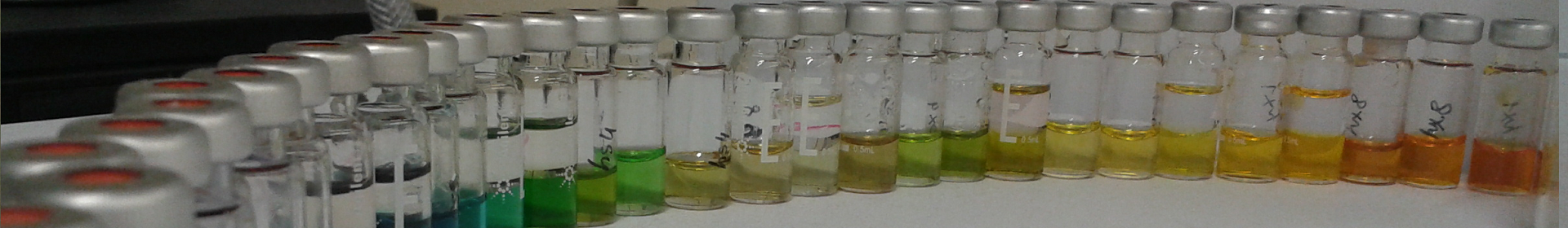
In this segment, we analyze an optimization experiment focusing on the sample pretreatment of four factors — pH, temperature, reaction time, and catalyst concentration. The intent is to maximize the peak areas of various amino acids.
File: ![]() bbd_example.csv
bbd_example.csv
Let’s zero in on one of the amino acids – Histidine – results.

(Table 5.5)
Observations and Analysis:
1. Quick Insights: Simple conditional formatting with a spreadsheet program instantly illuminates the most favorable regions with the highest peak areas.
2. Data Import: Bring the results into ValChrom. For users unfamiliar with this step, the design chapter provides detailed instructions.
3. Summary Assessment: As we have made repeated measurements at the center point, we can also estimate the significance of the effects. Repeated center point measurements offer insights into standard deviations, enabling us to discern significant deviations caused by factors and their interactions, and those that are just caused by random noise falling within measurement standard deviations. If executed correctly, the summary tab should separate significant from insignificant factors, suggesting many effects could be discarded to simplify our model.

(Fig 5.8)
Further insights reveal pH as a pivotal effect, with significant interactions mostly between pH and other factors.
4. Graphical Representation: Navigate to the “Graphs” tab. For clarity, disable Surface, and Contour plots, focusing solely on the Half-Normal and Pareto plots.

(Fig 5.9)
This visualization underscores the overriding significance of pH on the response— a pattern mirrored in the Pareto plots, where significant effects are color-differentiated.

(Fig 5.10)
5. Understanding Response Surfaces: A visual delve into response surfaces amplifies the dominant role of pH.


(Fig 5.11)
When you view the graphs, you’ll see that the plots for certain parameters, like temperature or reaction time, appear mostly “flat.” This indicates that varying these parameters doesn’t seem to affect our results much.
However, an immediate observation is the wild scattered data points – some lying above and others below the model’s predicted surface. You might think, “Doesn’t this mean our model is missing something?”
But here’s the catch: these scattered points are heavily influenced by pH changes.
Remember, our experiments involve changing several factors simultaneously. So, a lot of these wild data point positions result from the experiments being conducted at particularly high or low pH values, even if the graph you’re looking at is showing, say, Temperature x Reaction time ~ Response relationship.
When we fit our model, we separate the influence of each factor, including pH. That’s why, even if a graph like temperature versus response looks scattered due to pH variations, the actual predicted surface remains flat. This flatness highlights that when we consider all factors together, temperature or reaction time by themselves don’t play a significant role, unlike the pronounced effect of pH.
6. In essence we got the same results from several different representations, all relying on the response and factors model we created from out experiment plan
Note: this model is the full model with all effects we see under the summary tab, not the model with only significant effects. For that, we should make another run including only the significant effects, but there is no need for that, as the results are clear enough.
7. Concluding Thoughts: Our experiments underscore pH as the paramount factor. Yet, this analysis only scratches the surface— it’s constrained to a singular amino acid. Delving deeper, some amino acids, especially Ornithine (H), Lysine (H), and Tyrosine (H), exhibit contrasting trends. Intriguingly, this divergence is desired: the aim is to diminish the peak areas for these three while amplifying those for their twice-charged counterparts— Lys2+H, Orn2+2H, Tyr2+H.
5.1.6 Box-Behnken vs Full-factorial design example
In this example we will compare Box-Behnken design with Full factorial design.
| Factors | |||
| Coded value | -1 | 0 | +1 |
| pH | 9.1 | 9.6 | 10.1 |
| HFIP concentration* (mmol) | 4.5 | 5.0 | 5.5 |
| Column temperature (Co) | 35 | 40 | 45 |
| Mobile phase flow rate (ml/min) | 0.24 | 0.3 | 0.36 |
| * HFIP – 1,1,1,3,3,3-Hexafluoroisopropanol | |||
(Table 5.6)
| Responses: retention times (tR) | |
| Analyte | Abbreviation |
| meloxicam | MEL |
| ibuprofen | IBU |
| acetaminophen | ACE |
| firocoxib | FIR |
| flunixin | FLU |
| ketoprofen | KET |
| carprofen | CAR |
(Table 5.7)
File:
![]() bbd_vs_ffd_bbd_data.csv
bbd_vs_ffd_bbd_data.csv
We will compare these designs side by side to see the relative differences they have. We will look at two compounds: acetaminophen (ACE) and firocoxib (FIR).
| Number of experiments | |
| BBD | FFD |
| N = 2 • k(k-1) + C0k = 4 levels, C0 = 3 centrepoint measurementsN = 2 • 4(4-1) + 3 = 27 experiments | N = Lk + C0L = 3 levels, k = 4 factors, C0 = 2 additional centrepoint measurements N = 34 + 2 = 83 experiments |
(Table 5.8)
Next lets take a look at results.
Models
First the models for acetaminophen.
BBD FFD


(Fig 5.12)
Observations:
- Independent flow rate is missing from significant factors for BBD.
- Independent HFIP concentration factor is present in BBD.
- Strong pH effect is observable for both designs.
- Several interactions are present for pH, flow rate and HFIP concentration factors combinations, especially strong ones for pH with column temperature and pH with flow rate.
Note that HFIP concentration, column temperature and flow rate seem to be important in some combination, but depending on the design the combinations are somewhat different. This is caused by the reduced design for BBD where we don´t see as clear picture as for FFD where each corner of the design is explored with multiple measurements.
While from this it might seem initially that perhaps BBD is too inaccurate, lets not jump to conclusions just yet.
Next lets look at firocoxib.
BBD FFD


(Fig 5.13)
Observations:
- pH important in BBD, but independent factor missing from FFD.
- This compound behaves differently from ACE (and other analytes).
- Flow rate, column temperature seems less important in BBD.
Now we have an initial idea based on the model section. However, it should always be kept in mind that the significant factors calculated based on ANOVA test might be significant in statistical sense, but altogether less significant in practical sense. Thus, it is always necessary to take a look at the graphical data as well.
Graphs for acetaminophen.
Graphs for ph and mobile phase flow rate factors.
BBD FFD


(Fig 5.14)
We can see that while FFD picture is more fine grained and offers more reliability in the regions where there is only one measurement for BBD, the picture still largely looks the same. The predicted effect magnitude is also largely the same.
Graphs for flow rate and HFIP concentration factors.
BBD FFD


(Fig 5.15)
On these graphs we can also see that single points in BBD design have too much weight in their respective regions, curving the response plane, while with more reliable FFD multiple measurements the HFIP concentration effect is rather planar. This is the reason, why HFIP concentration initially seems to be significant in the model, compared to the FFD design.
Graphs for column temperature and HFIP concentration factors.
BBD FFD


(Fig 5.16)
Here it is also apparent how FFD is more finely analyzable, while for BBD there seems to be some effect for HFIP concentration at its extremes, that is not backed by more reliable FFD data. This is again the limitation of only having one datapoint for the extremes.
Graphs for firocoxib.
We can see the similar effects below for firocoxib, although the significant effects for it are different from acetaminophen, namely the lack of significant effect of pH.
Graphs for ph and mobile phase flow rate factors.
BBD FFD


(Fig 5.17)
Graphs for flow rate and HFIP concentration factors.
BBD FFD


(Fig 5.18)
Graphs for column temperature and HFIP concentration factors.
BBD FFD


(Fig 5.19)
Conclusion
An important observation from this comparison of BBD and FFD designs is that the large picture is still the same for both of them. Yes, FFD is much more detailed and reliable, but if we can allow this slight variation of BBD, we will win a lot in time and materials (27 runs compared to 83 runs). Also, we can mitigate the initial statistical effects of the model by looking at the graphs and concluding that even though the effect of HFIP seems statistically important, it is clear from the graphs that it is not practically important: it does not have a huge effect on the retention times.
5.2 Screening
When we’re developing a method, we often have a bunch of factors that we think might influence the results. But not all of them will have a significant impact. Screening designs help us sift through these factors without wasting too much time, effort, and resources on the insignificant ones. They give us a bird’s-eye view to figure out what’s essential and what’s not.
However, screening designs come with a trade-off. They help identify which factors matter but don’t exactly tell us by how much. The simplicity that makes screening designs resource-efficient can also cause some confusion when interpreting the results, especially when there are many factors interacting with each other. Screening designs are more about the “what” rather than the “how much”. For the detailed “how much”, we need optimization designs. These are more detailed and require more experiments but are also more precise, as you’ve seen before.
Now, let’s dive deeper into two popular screening designs to get a better sense of how they work and their limitations.
5.2.1 Fractional factorial design
(Fig 5.12)
Remember the full factorial design? Here, we explored every possible combination of factors. For instance, if we had three factors, and each could be at a ‘high’ or ‘low’ level, we’d have to run 23=8 experiments to cover all combinations.
But what if we had 10 factors? That would mean 210=1024 experiments, which is overwhelming!
But what if we could get a reasonable idea without running all 1024 tests?
This is where the fractional factorial design shines. As the name suggests, it’s only a “fraction” of the full factorial design. So, instead of running all possible combinations, we run just a fraction of them. This is a shortcut to get a general idea without diving deep into every detail.
For a 10-factor experiment:
- Full factorial: 1024 experiments
- 1/2 fractional factorial: 512 experiments
- 1/4 fractional factorial: 256 experiments
- 1/8 fractional factorial: 128 experiments
- 1/16 fractional factorial: 64 experiments …and so on.
For a clearer picture, consider a study with 7 factors:

(Table 5.6)
Let’s now look closely at a 4-factor full factorial design, where we’ll see every combination of factors. If you’ve read the full-factorial section, this should ring a bell.

(Table 5.7)
Now, let’s see what happens when we take only half of these combinations for a 1/2 fractional factorial design:

(Table 5.8)
Notice the pattern? The first three columns still have their familiar symmetry, but the fourth column, Factor D, breaks the pattern. In order to get the factor levels for the last factor, we multiply the previous ones.

(Table 5.9)
This combination method, known as the design generator, unveils how we determine the levels of each factor. For our 1/2 design, our generator was ‘a b c = abc’. Each letter represents a factor, and the combination ‘abc’ helps us figure out the levels for Factor D.
Similar logic goes for the 1/4 fractional design. Can you see how Factor C and D levels come about in this design?

(Table 5.10)
By the end of this, you should appreciate the beauty of fractional factorial designs. They’re our allies in efficiently deciphering which factors truly matter without drowning in a sea of endless experiments.
Let’s play with generators some more in ValChrom.
1) Go to https://valchrom.ut.ee/doe/
2) From “Sections” menu choose “Designs”
3) Select “Fractional-Factorial Designs”. You should see view like this:

(Fig 5.13)
4) Now, while there are sliders to change the number of factors and confounded factors, we will not use them. To have much more liberty to define our design we will use the generator.
5) In the text box “Enter generator…” type “a b ab”.

(Fig 5.14)
6) Click on the arrow. You should see design like this:

(Fig 5.15)
7) Notice that we have only half of the 3-factor 23=8 experiment design. That’s because the 3-rd factor is generated based on the previous 2.
8) Type “a b c ab abc” as a generator. You should see a 5-factor design with only 3-factor number of experiments.

(Fig 5.16)
9) This way you are at liberty to define the generators for each factor and cut down the number of experiments needed.
Fractional factorial designs are incredibly helpful when it comes to saving time and resources. However, like all good things, they have their caveats. Here are some of the limitations and challenges of using fractional factorial designs:
1. Resolution: Imagine trying to watch a movie on an old, low-resolution TV. The images might be blurry, and it might be hard to make out the details. In a similar way, when we run fewer experiments in our fractional factorial designs, we lose some detail or “resolution”. Certain effects can become intertwined, making it tough to tell them apart. This intertwining is called “confounding”, where it becomes hard to determine the unique effect of one factor because its levels are linked with another factor.
In our recent 5-factor design, which used the generator “a b c ab abc”, some effects got mixed up or confounded with each other.

(Table 5.11)
2. Higher-Order Interactions: Fractional factorial designs often operate under an assumption: they assume that interactions involving many factors (like three-factor, four-factor interactions, and so on) are not that important and can be ignored. This assumption is a double-edged sword. While it simplifies things, it can also mislead if, in reality, these higher-order interactions significantly impact our results.
3. Expertise Needed: Picking the right fractional factorial design has many facets that need considering. A mistake could mean missing out on important interactions or even getting misleading results. That’s why expertise is crucial. Without proper knowledge, there’s a risk of inadvertently sidelining vital information. Thus, it is advised to do more than to spare time by making an ill-informed guess at lesser design.
4. Incomplete Information: The very nature of fractional factorial designs means that we’re not looking at the full picture. We’re only running a subset of the possible experiments. This inherently carries the risk of missing the best settings or not picking up on certain impactful interactions.
5. Resolution Again!: The concept of the design’s resolution is central. A design’s resolution tells us which effects are confounded. For instance, a Resolution III design means main effects are confounded with two-factor interactions. A higher resolution design, like Resolution V, ensures that main effects aren’t confounded with any two-factor interactions, but they might still be mixed up with higher-order interactions. The higher the resolution, the less confounding, but also the more experiments required. This topic is too advanced for this course, but bear it in mind when deciding to use fractional factorial designs.
In essence, while fractional factorial designs offer immense advantages, it’s crucial to understand their limitations and use them effectively. Knowing the compromises you’re making helps in making more informed and accurate conclusions.
5.2.2 Plackett-Burman
When faced with numerous potential factors that might influence a response, the Plackett-Burman design stands out as a primary tool to identify which factors carry the most weight, especially when the list surpasses 8 and a detailed study of every factor is not practical.
Here are the key takeaways:
- Efficiency in Design: Plackett-Burman designs have a unique advantage: they require fewer experimental runs than traditional full factorial designs. This efficiency makes them both cost-effective and time-saving for preliminary screening endeavors. At their core, these designs are two-level fractional factorial setups. Notably, unlike the 2k designs where the run counts are powers of 2, Plackett-Burman designs align more with multiples of 4 (such as 8, 12, and 20 runs) – though they don’t encompass all multiples of 4.
- Prioritizing Main Effects: The primary objective of a Plackett-Burman design is to estimate main effects on a qualitative level. It doesn’t delve deep into the interactions between factors. In fact, it may not always reliably detect these interactions. An important caveat to remember is that main factors can sometimes intertwine with two-factor interactions. This overlap implies that a noticeable effect from a particular factor might be a combined result of that factor and an interaction effect.
- The Next Steps: After pinpointing the pivotal factors with the Plackett-Burman design, it’s prudent to engage in a comprehensive study (some optimizing design). Such a study will refine understanding and aid in optimizing the system, pivoting from qualitative insights to more quantitative, detailed results.
6. When experiments don´t go as planned
6.1 Messy results: Fractional Factorial Design with 7 Factors for MS
We’re diving into the complex world of a MS ion source with seven factors to analyse: Gas Flow, Nebulizer Pressure, Nozzle Voltage, Gas Temperature, Shealth Gas Flow, Shealth Gas Temperature, and Capillary Voltage.
The full factorial design approach would mean 27 = 128 experiments, a number that can be a little overwhelming. So, we opt for the 1/8 fraction which shrinks our efforts to 16 experiments, guided by the generator “a b c d abc cbd acd”.
File: ![]() frfd_messy.csv
frfd_messy.csv
Breaking Down Results for Sulfamethoxazole:
1. A peek at the summary reveals a surplus of effects in our model. Given that we’ve used just two levels and there’s no repetition, the ANOVA test is off the table. Instead, we shift our attention to the effect coefficients. It’s evident that many interactive effects have significant coefficients.
2. The visual aids, the Half-Normal and Pareto plots, echo this sentiment.

(Fig 6.1)

(Fig 6.2)
3. Contour plots bring out the clear influence of certain effects on the response, for instance, the Gas Flow.


(Fig 6.3)
However, there are also unmistakable signs of intricate interactions among various parameters, aligning with the model coefficients.


(Fig 6.4)
4. So, where does this leave us?
1. One option is to label MS as very sensitive to any parameter fluctuation. Here, every parameter counts and they are all interconnected. Even a minor deviation in one can throw the entire system off balance.
2. Alternatively, we might be wrestling with a design that’s brimming with confounding effects, given that we’ve taken a mere 1/8 fraction. To instill more confidence in our findings, perhaps venturing into a full factorial or another optimal design (like I-Optimal) is the way forward (we will not cover this design in this course, but you can probably understand general parts of it well enough now).
5. In fact, we went with option 2. and continued with the I-Optimal designs.
File: ![]() frfd_messy_ioptimal.csv
frfd_messy_ioptimal.csv
6. A striking change of I-Optimal design compared to fractional factorial design is the increase in the number of experiments and the three levels, in contrast to the prior two levels. This design, by nature, promises a higher reliability than our earlier fractional factorial approach.
7. The summary offers us insights about significant factors. Again, not many factors are lone wolves; most effects are intertwined.

(Fig 6.5)
8. However, the Half-Normal and Pareto plots reveal a contrasting picture.

(Fig 6.6)

(Fig 6.7)
Single factor effects and their quadratic counterparts have notable coefficients, signaling their influence. Yet, only Nebulizer2 passes the ANOVA significance test.
9. Surface plots further elucidate this point.


(Fig 6.8)

(Fig 6.9)
10. Yet, even with a more efficient design, the initial suspicion is reaffirmed: the MS is fickle, and every parameter deserves attention for optimization.
11. Some parameters still seem to be more important and we can get an idea where the optimal regions might lie.


(Fig 6.10)
12. In Conclusion: Experiments, especially with intricate systems like the MS, often tread on unpredictable paths. The challenge is not in getting flawless results but in navigating the complexity to draw meaningful insights.
7. Advancing in DoE
This section provided a basic introduction to the field of DoE. There are many other design types and methodologies that have not been covered here. With this foundational knowledge, you are encouraged to delve deeper into the subject and apply these principles in your own studies. Practical application and analysis of experiments will best advance the understanding of the intricacies and nuances of DoE.