- Style guide
- Style circles
- Core visual identity
- Middle circle
- Colours of faculties and topics
- Colours of the Faculty of Arts and Humanities
- Colours of the Faculty of Social Sciences
- Colours of the Faculty of Medicine
- Colours of the Faculty of Science and Technology
- Colours of the entrepreneurship topic
- Colours of the culture topic
- Colours of the student life topic
- Outer style circle
- Logos
- Design principles
- Colours
- Design examples
- Special cases
- Materials for download
Layout principles
Protected area of the logo
The logo has a protected area that must be kept clear of other design elements and their parts. When placing the logo, the size of the protected area must be taken into account.
The protected areas of the primary logo and the logos of faculties and units are determined by the height of the image of the portico (excluding the space taken up by the year).
The protected areas of the stacked and circular logos are determined by the height of the pillars in the image of the portico.
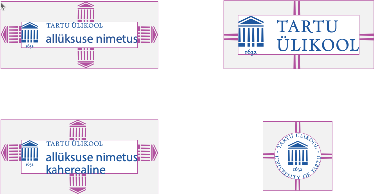
When the university logo is used together with the names of faculties and units in a horizontal or vertical layout, the protected area at the edges is determined by the height of the image of the portico (excluding the space taken up by the year).
In a horizontal layout, the space between the logo and the names of the units is determined by the combined width of two images of the portico next to each other.
In a vertical layout, the space between the university logo and the name of the first unit equals the height of the pillars in the portico image and, between other names, twice that height.


Restrictions on using the logo
The logo must not
- be stretched in any direction, and the proportions of its elements must not be altered;
- be supplemented or altered with additional text.
Any additional text must be set apart from the logo and must not form an independent whole with the logo.
The logo elements must not
- be moved or added;
- be used for creating new (partnership) logos.
See also how to use the logos to signify partnership.
Only the signature blue and white may be used in university logos, except when
- only black-and-white printing is possible, or
- the logo is carved or engraved (e.g. on metal or wood).
The allowed colour combinations are the signature blue on white or white on the primary colours.