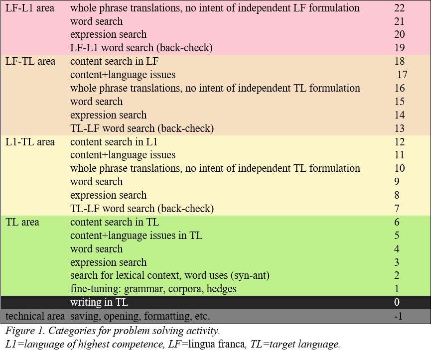
Technical data for creating the dygraphs

L1 = language of highest competence
LF = lingua franca
TL = target language
The dygraphs on this page have been created with R (R Core Team 2021), using the dygraphs package (Vanderkam, Allaire, Owen, Gromer, Thieurmel 2018). To create the dygraph, you need an Excel table where in Column A you have a timeline of the writing process by each 100 milliseconds, and in Column B the category of the source used at that time as a numeric value.
From Inputlog data, you get the timestamp of the focus/source switch, which needs to be densified with data from all the moments between the switches; this can be done in MS Excel, by creating one table with the switch timestamps (in seconds) in one column, and the source category in the other, and a second table: start at 0, fill series in column with a step value of 0.1 and stop value of the last switch (rounded to one space after the comma). These tables can then be merged (left join; tutorial here) and the missing category values filled in (see here how).
Creating graphs with R
Required packages
Requirement: dygraph
Other necessary packages: readxl, xts, magrittr.
For adding a checklist that allows to select which participants to display, a plugin is needed: hide.js
To activate hide plugin (each time you run R after closing it):
dyHide <-function(dygraph) {
dyPlugin(
dygraph = dygraph,
name = "Hide",
path = system.file("plugins/hide.js", package = "dygraphs")
)
}
The code for creating individual graphs:
dygraph(dataset name, main = "graph title") %>%
dyAxis("y", label = "Label for Column 1 in dataset", valueRange = c(-1, 22)) %>%
 #Complexity score value range, replace values if necessary
dyAxis("x", drawGrid=F) %>%
dyAxis("y", drawGrid=F) %>%
dyLimit(-1, "range1", labelLoc="right", color="black") %>%
#range1: -1 to 0, in our graph "technical area"
dyShading(-1, 0, color="grey", axis="y") %>%
dyShading(0, 5, color="#ccff99", axis="y") %>%
dyLimit(0, "range2", strokePattern = "solid", labelLoc="right", color="grey") %>%
#range2: 0 to 5, in our graph "TL" or target language activity
dyLimit(5, "range3", labelLoc="right", color="grey") %>%
#range3: 5 to 10, in our graph "L1-TL" or activity between L1 and the target language
dyLimit(10, "range4", labelLoc="right", color="grey") %>%
#range4: 10 to 15, in our graph "LF-TL" or activity between a lingua franca and the target language
dyLimit(15, "range5", labelLoc="right", color="grey") %>%
#range 5: 15 to 20, in our graph "L1-LF" or activity between L1 and a lingua franca
dyShading(5, 10, color="#ffffcc", axis="y") %>%
dyShading(10, 15, color="#ffebcc", axis="y") %>%
dyShading(15, 20, color="#ffcccc", axis="y") %>%
dyOptions(drawPoints = TRUE) %>%
dyOptions(fillGraph = TRUE) %>%
dyRangeSelector %>%
dyLegend(width = 200)
The code for creating group graph:
For combining graphs you need to have all participants on the same Excel sheet, with their IDs as column names. For all that have a shorter writing process than the participant who wrote the longest, fill in NA values.
dygraph(dataset_name, main = "graph title") %>%
dyAxis("y", label = "Label for Column 1 in dataset", valueRange = c(-1, 22)) %>%
#Complexity score value range, replace values if necessary
dyAxis("x", drawGrid=F) %>%
dyAxis("y", drawGrid=F) %>%
dyLimit(-1, "range 1", labelLoc="right", color="black") %>%
#range1: -1 to 0, in our graph "technical area"
dySeries ("column name", label = "display label", color = "black") %>%
#series are individual columns, color refers to stroke line. Add as many as you need.
dyGroup (c("column 1", "column 2"), label = "display label", color = c("#73006b", "#c2000b")) %>%
#Groups include several series, i.e. columns. Each series needs a color assigned to it.
dyShading(-1, 0, color="grey", axis="y") %>%
dyShading(0, 6, color="#ccff99", axis="y") %>%
dyLimit(0, "range 2", strokePattern = "solid", labelLoc="right", color="grey") %>%
#range2: 0 to 5, in our graph "TL" or target language activity
dyLimit(6, "range 3", labelLoc="right", color="grey") %>%
#range3: 5 to 10, in our graph "L1-TL" or activity between L1 and the target language
dyLimit(12, "range 4", labelLoc="right", color="grey") %>%
#range4: 10 to 15, in our graph "LF-TL" or activity between a lingua franca and the target language
dyLimit(18, "range5", labelLoc="right", color="grey") %>%
#range 5: 15 to 20, in our graph "L1-LF" or activity between L1 and a lingua franca
dyShading(6, 12, color="#ffffcc", axis="y") %>%
dyShading(12, 18, color="#ffebcc", axis="y") %>%
dyShading(18, 22, color="#ffcccc", axis="y") %>%
dyOptions(fillGraph = TRUE) %>%
dyRangeSelector %>%
dyHide()
dyLegend(width = 200)

